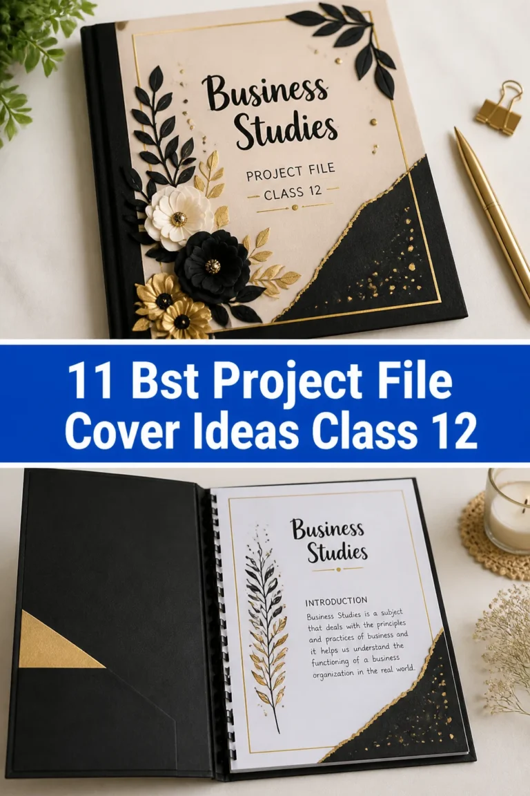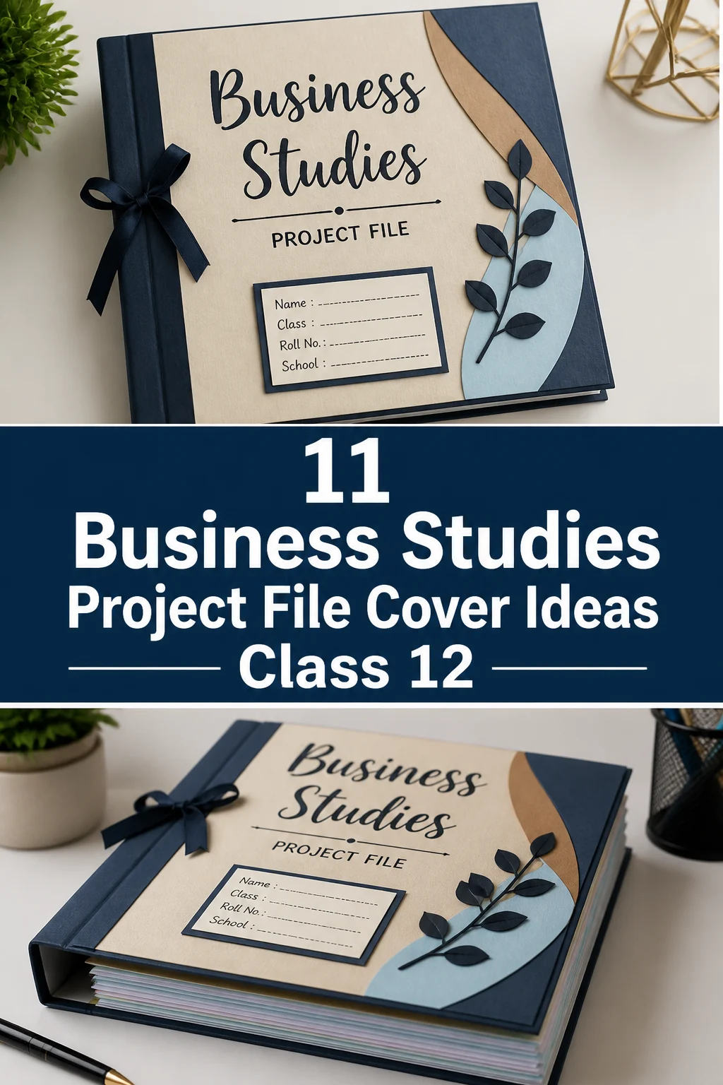
💼 11 Business Studies Project File Cover Ideas Class 12
We all know the struggle.
You spent weeks researching marketing strategies only to realize your file looks like a soggy sandwich.
Let’s fix that before your teacher judges your soul based on a piece of dusty cardboard.
Here are some top tier ways to make that project pop.
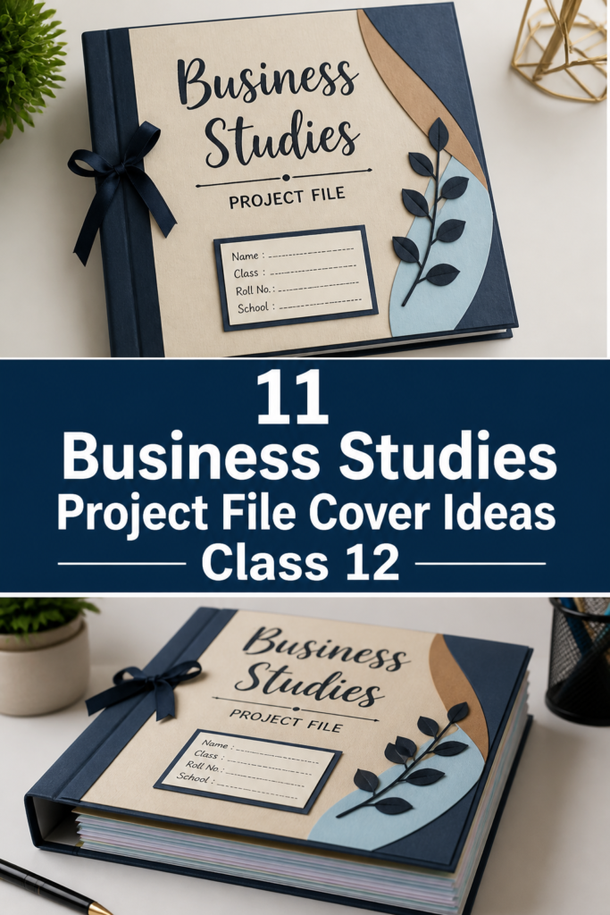
1. The Corporate Minimalist
- Best For: Students who want to look like they already have an MBA
- Vibe: Sleek and professional
- Why it works: It screams sophistication without trying too hard.
Grab some navy blue cardstock and use silver metallic pens for the lettering. Keep the layout centered and symmetrical to satisfy your inner perfectionist. This style works perfectly for projects on Principles of Management where order is everything.
Pro Tip: Use a metal ruler unless you want your professional look to resemble a mountain range.
2. The Stock Market Glitch
- Best For: Finance geeks and future wall street types
- Vibe: High energy and modern
- Why it works: Red and green lines instantly signal business to anyone with eyes.
Print out a candlestick chart background and overlay it with a translucent vellum sheet. Use neon green markers to highlight the upward trends. It makes even the most boring Financial Markets project look like a high-stakes trade.
Pro Tip: Avoid using actual red ink for your name because teachers have weird feelings about that color.
3. The Sustainable Eco-Leaf
- Best For: The Business Environment chapter enthusiasts
- Vibe: Earthy and conscious
- Why it works: Sustainability is the biggest trend in the corporate world right now.
Use brown kraft paper as your base and glue on some jute twine or pressed leaves. You can even use recycled newspaper clippings for a cool collage effect. It shows you care about the planet and your internal assessment marks simultaneously.
Pro Tip: Use a glue stick instead of liquid glue to avoid those ugly paper wrinkles.
4. The 3D Pop Art Marketing
- Best For: Marketing Management projects
- Vibe: Bold and loud
- Why it works: It grabs attention just like a real advertisement should.
Cut out famous brand logos from old magazines and stick them on with double-sided foam tape for a 3D effect. Add some comic book style speech bubbles for the project title. This cover basically does the marketing for you.
Pro Tip: Focus on contrasting colors like yellow and purple to make the logos jump out.
5. The Blueprint Architect
- Best For: Organizing and Staffing topics
- Vibe: Technical and structured
- Why it works: It makes your project look like a master plan for success.
Use bright blue paper and draw your title in white gel pen to mimic an architectural blueprint. Draw some geometric shapes and organizational charts in the background. It looks incredibly smart and very intentional.
Pro Tip: A white paint marker works better than a gel pen for thicker and more opaque lines.
6. The Vintage Newspaper
- Best For: History of Commerce or traditional business models
- Vibe: Classic and timeless
- Why it works: It gives off a serious journalist energy that teachers usually love.
Dab some tea bags on white paper to give it an aged and yellowed look. Print your title in a bold serif font like Times New Roman. Wrap the spine in black electrical tape for a faux-leather book binding feel.
Pro Tip: Let the paper dry completely before writing on it or the ink will bleed everywhere.
7. The Digital App Interface
- Best For: E-business or Consumer Protection projects
- Vibe: Tech-savvy and futuristic
- Why it works: It relates the subject to the apps we use every single day.
Design the cover to look like a smartphone screen with icons representing different chapters. Use rounded corner cutouts for the screen and add a glossy plastic sheet on top. It looks like you spent way more time on it than you actually did.
Pro Tip: Use a compass to get those icon circles perfectly round.
8. The Abstract Geometric
- Best For: General Business Studies overviews
- Vibe: Artistic and clean
- Why it works: It is visually pleasing without needing a specific theme.
Use washi tape in different patterns to create random triangles and squares across the cover. Fill some shapes with solid pastel colors and leave others blank. It is the easiest way to look aesthetic with zero drawing skills.
Pro Tip: Peel the washi tape slowly if you need to reposition it so you do not rip the paper.
9. The Global Map Mosaic
- Best For: International Business or Globalization topics
- Vibe: Adventurous and expansive
- Why it works: It shows the big picture of how business connects the world.
Find an old world map and tear it into small pieces to create a mosaic background. Place your title on a white cardstock banner in the center. Use gold glitter glue to trace the borders of major trading countries.
Pro Tip: Use a spray adhesive for the mosaic pieces to save your time and your sanity.
10. The Blackboard Chalkboard
- Best For: Classroom-based case studies
- Vibe: Academic and nostalgic
- Why it works: It is a classic look that never goes out of style in education.
Cover your file in black matte paper and use white chalk pencils for the design. Draw small doodles of calculators, pens, and graphs in the corners. It looks like a brainstorming session gone right.
Pro Tip: Spray a little hairspray over the chalk to prevent it from smudging during transport.
11. The Luxury Brand Aesthetic
- Best For: High-end Marketing or Branding projects
- Vibe: Expensive and elite
- Why it works: Everyone loves a bit of luxury even if it is just on a school file.
Use quilted pattern paper or black textured cardstock. Add a gold ribbon as a vertical stripe and use embossed stickers for your name. It looks like something you would find in a CEO office rather than a backpack.
Pro Tip: A hot glue gun is your best friend for securing ribbons and heavy stickers.
Our Top Recommended Finds
- A heavy-duty paper cutter: This ensures your edges are crisp and professional instead of looking like they were chewed by a squirrel.
- Dual-tip brush pens: These give you the flexibility of fine lines for details and broad strokes for headings.
- Double-sided foam tape: Essential for creating that 3D depth that makes your cover look expensive and custom-made.
Which of these will you try first?
Your project deserves better than a boring plastic folder from the corner shop.
Pick a vibe that matches your personality and watch your internal assessment marks soar.
Are you going for the sleek corporate look or the chaotic pop art style?