✍️ How To Write Cursive Step By Step
I still remember the immense satisfaction of forming my first elegant ‘S’ in cursive.
It felt like unlocking a secret code, a graceful way of writing that instantly elevated my notes and personal letters.
This guide distills years of practice and teaching into simple, actionable steps, helping you master cursive with confidence and ease.
Quick Overview
This guide will walk you through the foundational techniques of cursive writing, from mastering basic strokes to forming complete words and sentences.
You will learn the rhythm, connections, and forms that make cursive a beautiful and efficient script.
- Time needed: 2-4 hours for initial learning; consistent practice for mastery
- Difficulty: Beginner
- What you’ll need: Pen, lined paper, and a desire to learn
Step-by-Step Instructions
Step 1: Gather Your Tools and Set the Stage
Before you begin, ensure you have the right environment and materials for learning.
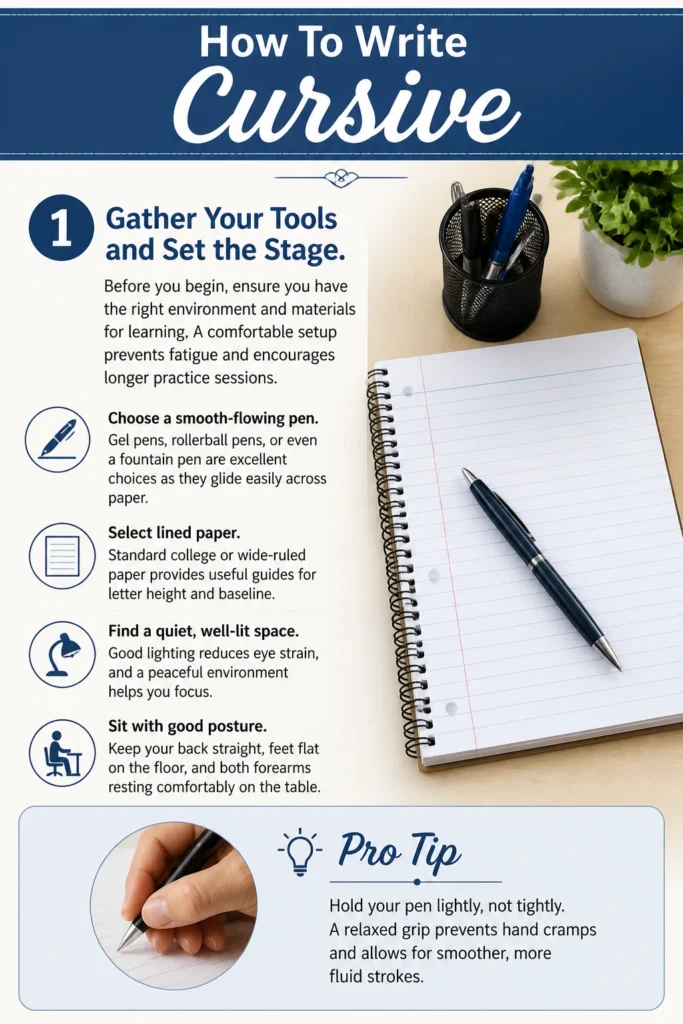
A comfortable setup prevents fatigue and encourages longer practice sessions.
- Choose a smooth-flowing pen. Gel pens, rollerball pens, or even a fountain pen are excellent choices as they glide easily across paper.
- Select lined paper. Standard college or wide-ruled paper provides useful guides for letter height and baseline.
- Find a quiet, well-lit space. Good lighting reduces eye strain, and a peaceful environment helps you focus.
- Sit with good posture. Keep your back straight, feet flat on the floor, and both forearms resting comfortably on the table.
Pro Tip: Hold your pen lightly, not tightly. A relaxed grip prevents hand cramps and allows for smoother, more fluid strokes.
Step 2: Master the Basic Strokes
Cursive is built upon a few fundamental strokes that connect letters seamlessly.
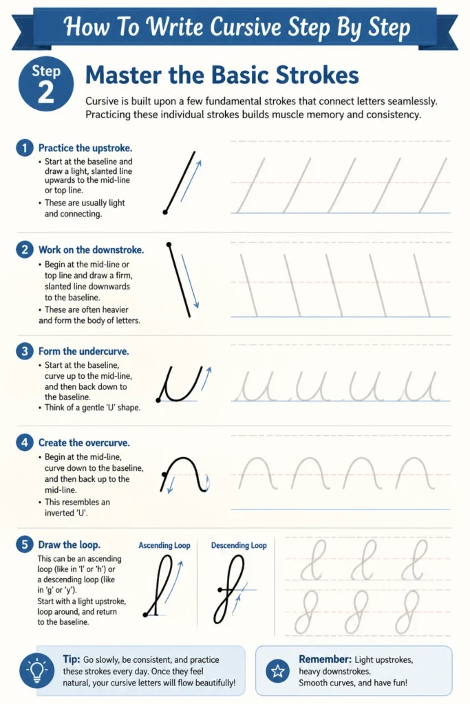
Practicing these individual strokes builds muscle memory and consistency.
- Practice the upstroke. Start at the baseline and draw a light, slanted line upwards to the mid-line or top line. These are usually light and connecting.
- Work on the downstroke. Begin at the mid-line or top line and draw a firm, slanted line downwards to the baseline. These are often heavier and form the body of letters.
- Form the undercurve. Start at the baseline, curve up to the mid-line, and then back down to the baseline. Think of a gentle ‘U’ shape.
- Create the overcurve. Begin at the mid-line, curve down to the baseline, and then back up to the mid-line. This resembles an inverted ‘U’.
- Draw the loop. This can be an ascending loop (like in ‘l’ or ‘h’) or a descending loop (like in ‘g’ or ‘y’). Focus on smooth, continuous movement.
Step 3: Form Lowercase Letters – Group 1 (Undercurve Starters)
Many lowercase letters begin with a similar undercurve stroke, making them easier to learn together.
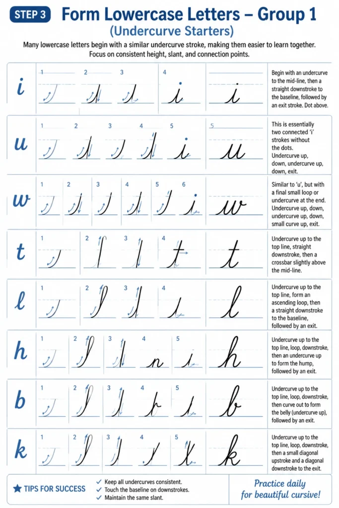
Focus on consistent height, slant, and connection points.
- Start with ‘i’. Begin with an undercurve to the mid-line, then a straight downstroke to the baseline, followed by an exit stroke. Dot above.
- Move to ‘u’. This is essentially two connected ‘i’ strokes without the dots. Undercurve up, down, undercurve up, down, exit.
- Practice ‘w’. Similar to ‘u’, but with a final small loop or undercurve at the end. Undercurve up, down, undercurve up, down, small curve up, exit.
- Form ‘t’. Undercurve up to the top line, straight downstroke, then a crossbar slightly above the mid-line.
- Learn ‘l’. Undercurve up to the top line, form an ascending loop, then a straight downstroke to the baseline, followed by an exit stroke.
- Write ‘e’. Begin with an undercurve, loop around to form a small ‘e’ shape, and exit. It’s a small, open loop.
Pro Tip: Use a dashed mid-line on your practice paper if available. This helps maintain consistent letter height for smaller letters.
Step 4: Form Lowercase Letters – Group 2 (Overcurve and Loop Starters)
This group introduces letters that start with an overcurve or a more complex loop, requiring careful control.
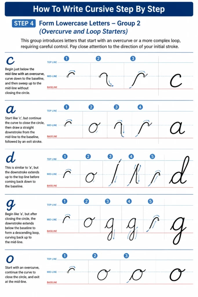
Pay close attention to the direction of your initial stroke.
- Practice ‘c’. Begin just below the mid-line with an overcurve, curve down to the baseline, and then sweep up to the mid-line without closing the circle.
- Form ‘a’. Start like ‘c’, but continue the curve to close the circle, then draw a straight downstroke from the mid-line to the baseline, followed by an exit stroke.
- Write ‘d’. This is similar to ‘a’, but the downstroke extends up to the top line before coming back down to the baseline.
- Learn ‘g’. Begin like ‘a’, but after closing the circle, the downstroke extends below the baseline to form a descending loop, curving back up to the mid-line.
- Master ‘o’. Start with an overcurve, loop around to close the circle at the top, and then create a small internal loop or exit stroke from the top right.
- Practice ‘q’. Similar to ‘o’, but the descending stroke goes straight down below the baseline before curving up to the mid-line, without a loop.
Step 5: Form Lowercase Letters – Group 3 (Unique Shapes and Descenders)
These letters often have distinct shapes or prominent descending strokes that require focused practice.
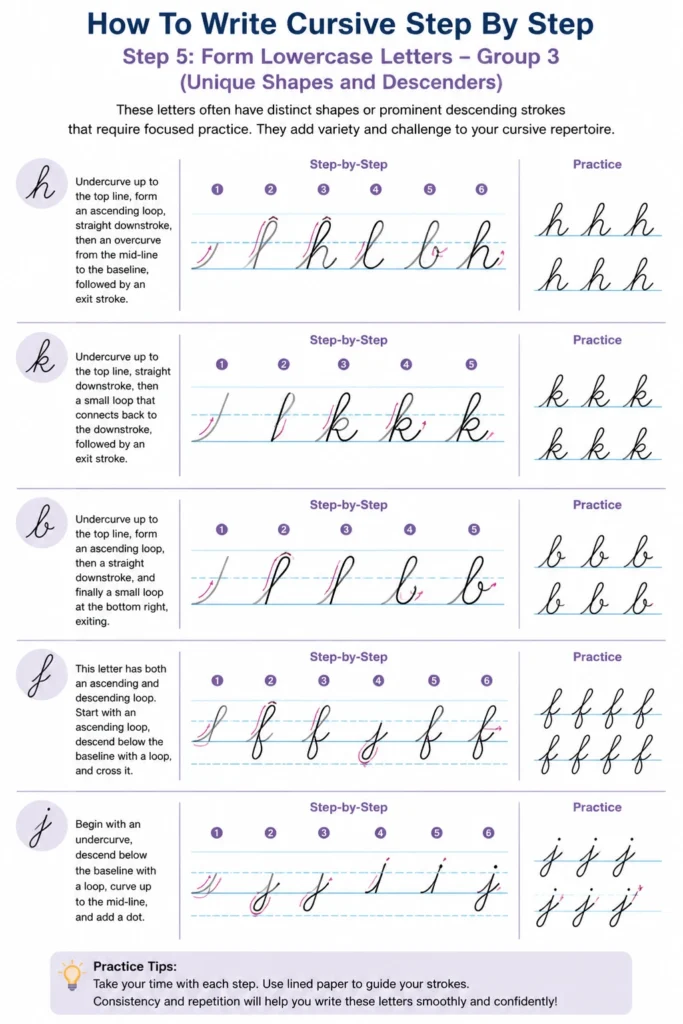
They add variety and challenge to your cursive repertoire.
- Work on ‘h’. Undercurve up to the top line, form an ascending loop, straight downstroke, then an overcurve from the mid-line to the baseline, followed by an exit stroke.
- Practice ‘k’. Undercurve up to the top line, straight downstroke, then a small loop that connects back to the downstroke, followed by an exit stroke.
- Form ‘b’. Undercurve up to the top line, form an ascending loop, then a straight downstroke, and finally a small loop at the bottom right, exiting.
- Write ‘f’. This letter has both an ascending and descending loop. Start with an ascending loop, descend below the baseline with a loop, and cross it.
- Learn ‘j’. Begin with an undercurve to the mid-line, straight downstroke below the baseline with a descending loop, then dot above.
- Master ‘p’. Undercurve up to the mid-line, straight downstroke below the baseline, then an overcurve that connects back to the downstroke at the mid-line, exiting.
- Practice ‘r’. Undercurve up to the mid-line, small overcurve, then a short downstroke and exit.
- Form ‘s’. Begin with an undercurve, sweep up to the mid-line, curve back down, and then loop up to the mid-line, exiting.
- Write ‘v’. Undercurve up to the mid-line, curve down to the baseline, then an upward stroke to the mid-line, with a small loop or exit stroke.
- Learn ‘x’. Start with an overcurve from the mid-line down to the baseline, then lift your pen and draw a crossing stroke from the top left to the bottom right.
- Master ‘y’. Undercurve up to the mid-line, down to the baseline, then a descending loop below the baseline, curving up to the mid-line.
- Practice ‘z’. Undercurve up to the mid-line, then a slight overcurve, followed by a descending loop below the baseline, curving back up to the mid-line.
Step 6: Connecting Letters to Form Words
The true beauty of cursive lies in its flowing connections between letters.
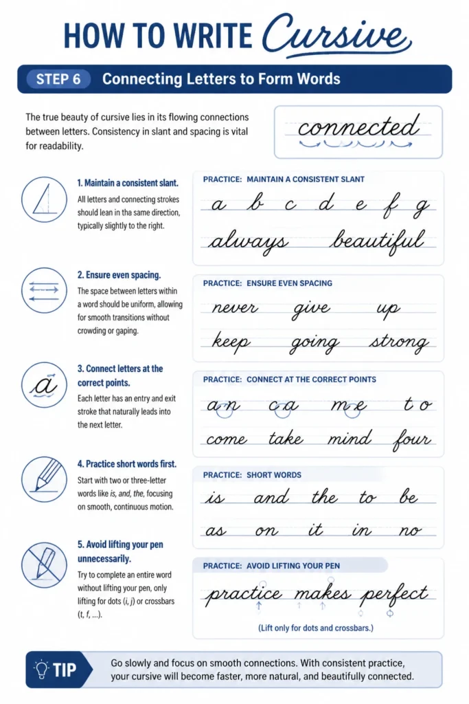
Consistency in slant and spacing is vital for readability.
- Maintain a consistent slant. All letters and connecting strokes should lean in the same direction, typically slightly to the right.
- Ensure even spacing. The space between letters within a word should be uniform, allowing for smooth transitions without crowding or gaping.
- Connect letters at the correct points. Each letter has an entry and exit stroke that naturally leads into the next letter.
- Practice short words first. Start with two or three-letter words like “is,” “and,” “the,” focusing on smooth, continuous motion.
- Avoid lifting your pen unnecessarily. Try to complete an entire word without lifting your pen, only lifting for dots (i, j) or crossbars (t, f).
Pro Tip: Imagine a gentle, consistent rhythm as you write. This helps regulate your speed and ensures a natural flow between letters.
Step 7: Practice Uppercase Letters
Uppercase letters often have more decorative flourishes and distinct forms compared to their lowercase counterparts.
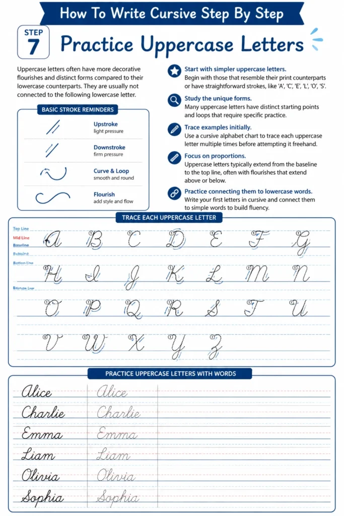
They are usually not connected to the following lowercase letter.
- Start with simpler uppercase letters. Begin with those that resemble their print counterparts or have straightforward strokes, like ‘A’, ‘C’, ‘E’, ‘L’, ‘O’, ‘S’.
- Study the unique forms. Many uppercase letters have distinct starting points and loops that require specific practice.
- Trace examples initially. Use a cursive alphabet chart to trace each uppercase letter multiple times before attempting it freehand.
- Focus on proportions. Uppercase letters typically extend from the baseline to the top line, often with flourishes that extend above or below.
- Practice connecting them to lowercase words. Write your first name, then your full name, focusing on the transition from the capital letter to the rest of the word.
Step 8: Practice Sentences and Paragraphs
Once you are comfortable with individual letters and short words, it’s time to build fluency.
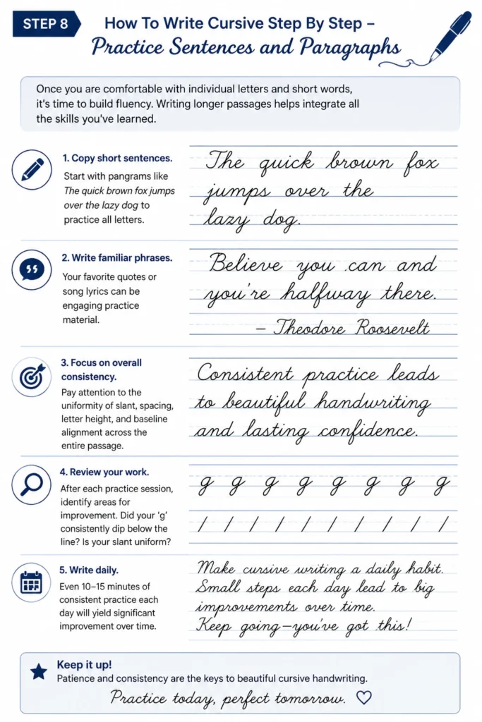
Writing longer passages helps integrate all the skills you’ve learned.
- Copy short sentences. Start with pangrams like “The quick brown fox jumps over the lazy dog” to practice all letters.
- Write familiar phrases. Your favorite quotes or song lyrics can be engaging practice material.
- Focus on overall consistency. Pay attention to the uniformity of slant, spacing, letter height, and baseline alignment across the entire passage.
- Review your work. After each practice session, identify areas for improvement. Did your ‘g’ consistently dip below the line? Is your slant uniform?
- Write daily. Even 10-15 minutes of consistent practice each day will yield significant improvement over time.
Common Mistakes to Avoid
Inconsistent Slant
One of the most common issues is an uneven slant in your letters and connecting strokes.
This makes your cursive appear messy and difficult to read.
To correct this, consciously visualize a consistent lean, often around 5-10 degrees to the right, for every stroke. Practice on paper with slanted guidelines or draw your own.
Uneven Spacing
Letters that are too close together or too far apart within a word disrupt the flow and readability of cursive.
It can make your writing look rushed or disjointed.
Focus on maintaining a consistent, comfortable gap between letters. Practice words slowly, paying attention to the space each connection creates.
Too Much Pressure
Pressing down too hard on your pen can lead to hand fatigue, slower writing, and indentations on the paper.
It also makes your lines appear heavy and less graceful.
Cultivate a lighter touch. Let the pen glide effortlessly across the paper, using just enough pressure for the ink to flow smoothly.
Rushing the Process
Learning cursive is a skill that develops with patience and deliberate practice, not speed.
Trying to write too quickly before mastering the forms often results in sloppy, illegible handwriting.
Slow down. Focus on forming each letter correctly and connecting them smoothly. Speed will naturally increase as your muscle memory improves.
Troubleshooting
Hand Cramps or Fatigue
If your hand aches during or after practice, your grip or posture might be the culprit.
This is a common issue when starting a new fine motor skill.
Check your pen grip; it should be relaxed, not death-tight. Ensure your posture is good, and take frequent, short breaks to stretch your hand and wrist.
Letters Don’t Connect Smoothly
When letters look disjointed or have awkward gaps, it’s usually due to inconsistent entry and exit strokes.
The natural flow of cursive depends on these smooth transitions.
Revisit your basic strokes and focus on the precise angle and length of the connecting lines. Practice individual letter pairings (e.g., ‘ab’, ‘cd’) until the connection feels natural.
My Cursive Looks Messy/Inconsistent
Achieving uniformity takes time and consistent effort, and initial attempts can look uneven.
Don’t get discouraged; this is part of the learning curve.
Use a cursive workbook with tracing exercises to build muscle memory. Pay close attention to letter height, spacing, and slant. Consistent daily practice, even for short periods, will bring noticeable improvement.
Key Takeaways
- Start with basic strokes and individual lowercase letters before attempting full words.
- Practice consistently, even if only for 10-15 minutes each day, to build muscle memory.
- Focus on maintaining a uniform slant, consistent spacing, and correct letter height.
- Patience is crucial; mastery of cursive is a journey, not a sprint.
- Ensure you use comfortable tools and maintain good posture to prevent fatigue.
- Embrace mistakes as learning opportunities and don’t be afraid to revisit foundational steps.
Frequently Asked Questions
Is cursive still relevant today?
Absolutely. While less common in daily use, cursive offers numerous benefits, including improved fine motor skills, enhanced brain activity, and a faster way to take notes. It’s also essential for reading historical documents and signing your name.
How long does it take to learn cursive?
You can grasp the basic forms and connections within a few hours of dedicated practice. However, achieving fluency, speed, and a personalized, elegant style takes consistent practice over weeks or months. It’s an ongoing skill to refine.
Can I learn cursive if I have bad handwriting?
Yes, definitely! Cursive is a distinct script with its own set of rules and forms. It’s a new skill, not an extension of your current print handwriting. Many people find that learning cursive actually improves their overall penmanship.
Should I use a special pen for cursive?
While any comfortable pen can work, a smooth-flowing pen like a gel pen, rollerball, or fountain pen can enhance the experience. They require less pressure, allowing for more fluid and effortless strokes, which is ideal for cursive.
Our Top Recommended Finds
- Cursive Practice Workbooks: These offer guided lines, letter-by-letter breakdowns, and tracing exercises to help you build foundational skills efficiently.
- Quality Gel Pens or Rollerball Pens: Pens with smooth ink flow and a comfortable grip reduce hand strain and make writing a more enjoyable experience.
- Lined Paper with Mid-lines: Paper specifically designed for handwriting, often with a dashed mid-line, provides excellent visual guidance for consistent letter height and spacing.
Embrace the Art of Connected Writing
Learning cursive is more than just acquiring a new skill; it’s an opportunity to connect with a timeless art form.
It offers a personal touch in an increasingly digital world, a meditative practice, and a way to express yourself with grace.
Take the first step today. Pick up a pen, open your notebook, and begin your journey into the elegant world of connected script. Your unique handwriting awaits.