🎨 How To Decorate A Poster For School
Remember those school projects that filled you with a mix of excitement and mild panic? I certainly do. Crafting a poster for a presentation was always a big part of my school life, from elementary science fairs to high school history projects.
Over the years, I learned practical ways to make posters stand out, ensuring my message was clear and my effort shone through. This guide shares those tested strategies, helping you create a poster that truly impresses your teachers and classmates.
Quick Overview
Creating a fantastic school poster is a rewarding process that combines creativity with clear communication. You’ll learn how to plan, design, and add visual appeal to ensure your project makes a strong impact.
- Time needed: 2-4 hours (depending on complexity and drying time)
- Difficulty: Beginner
- What you’ll need: Poster board, markers, pencils, ruler, scissors, glue, research materials, optional decorative items.
Step-by-Step Instructions
Step 1: Understand Your Assignment and Topic
Before you even touch a marker, take time to fully grasp what your teacher expects. Read the rubric or instructions carefully, noting key requirements like content, size, and presentation style. Knowing these details upfront saves you from rework later.

Think about your topic and what main points you need to convey. Brainstorm keywords, facts, and ideas that are essential for your audience to understand. This initial groundwork forms the backbone of your entire poster.
Pro Tip: Break down complex topics into 3-5 main ideas. This makes it easier to organize your information visually and prevents your poster from becoming too crowded.
Step 2: Gather Your Materials
Having all your supplies ready before you start prevents interruptions and keeps your creative flow going. Make a list based on your design ideas and collect everything you’ll need. This includes the poster board itself, which comes in various sizes and colors.

Essential tools include pencils for sketching, a good eraser for corrections, and a ruler for straight lines. You’ll also need a variety of markers or colored pencils for text and illustrations. Don’t forget scissors, glue, and any specific images or printouts you plan to use.
Step 3: Plan Your Layout and Design
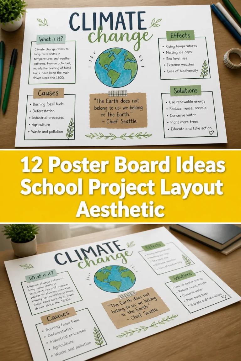
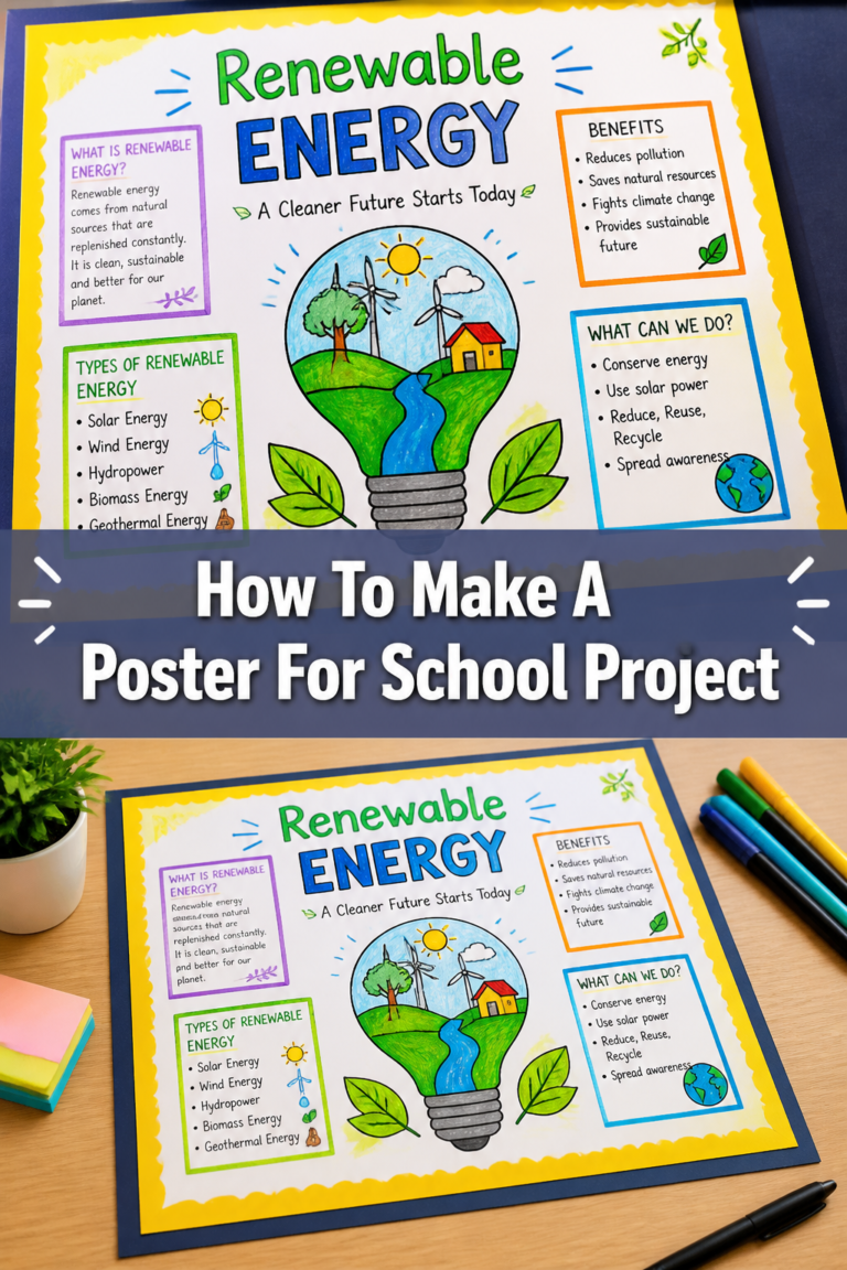
A well-planned layout is crucial for a readable and effective poster. Start by sketching a few mini-versions of your poster on scrap paper. These “thumbnails” help you decide where text, images, and headings will go.

Consider a clear flow, usually from left to right and top to bottom, guiding the viewer’s eye. Designate a prominent space for your title, a central area for your main points, and supporting sections for details or visuals. Aim for balance and avoid making one section look too heavy.
Step 4: Craft Your Main Message (Text)
Your poster’s text needs to be clear, concise, and easy to read from a distance. Begin by writing your title in large, bold letters at the top. This immediately tells viewers what your poster is about.

For headings and subheadings, use slightly smaller but still prominent lettering. Keep paragraphs very short, focusing on one key idea per section. Use bullet points or numbered lists to present information clearly and efficiently.
Pro Tip: Before writing on the poster, lightly pencil in all your text outlines. This allows you to check for spacing, alignment, and errors before making anything permanent.
Step 5: Add Engaging Visual Elements
Visuals are incredibly powerful for school posters; they grab attention and help explain complex ideas. Incorporate drawings, diagrams, charts, or printed images that directly relate to your topic. Ensure all visuals are high-quality and clearly visible.

Think about how visuals can support your text, rather than just decorating the space. A diagram illustrating a process or a graph showing data can be far more impactful than a lengthy paragraph. Place visuals near the relevant text sections.
Step 6: Use Color Effectively and Strategically
Color can transform a plain poster into an eye-catching display, but use it thoughtfully. Choose a color scheme that is appropriate for your topic and easy on the eyes. High contrast between your text color and background color is essential for readability.

For example, dark text on a light background is usually best. Use brighter colors to highlight key information or create visual interest. Avoid using too many clashing colors, which can make your poster look messy and hard to focus on.
Step 7: Refine and Polish Your Poster
Once your main elements are in place, it’s time for the finishing touches that make your poster look professional. Add borders around sections or the entire poster using a ruler and a marker for a clean, defined look. You can also use decorative tape or paper strips for this.
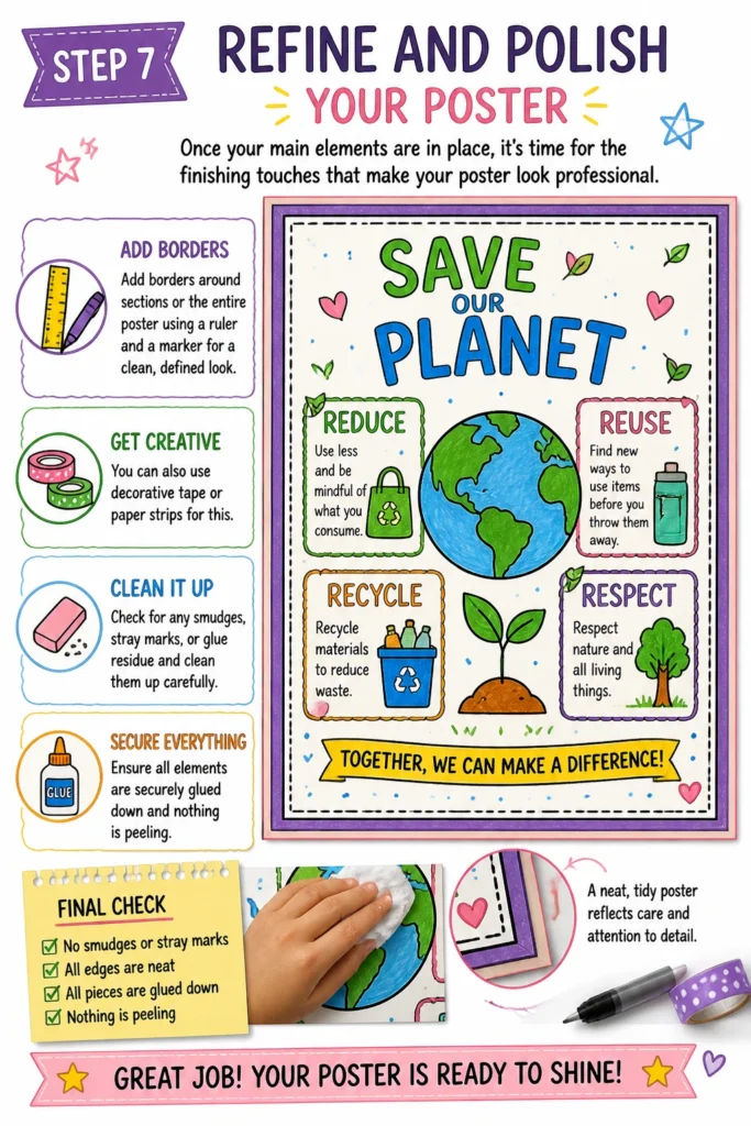
Check for any smudges, stray marks, or glue residue and clean them up carefully. Ensure all elements are securely glued down and nothing is peeling. A neat, tidy poster reflects care and attention to detail.
Step 8: Review and Practice Your Presentation
Before the big day, step back and view your poster from a distance. Is the text readable? Are the visuals clear? Ask a family member or friend to review it for clarity and impact. They might spot something you missed.
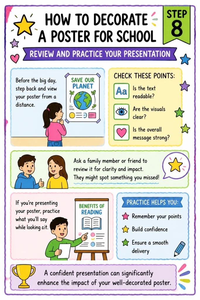
If you’re presenting your poster, practice what you’ll say while looking at it. This helps you remember your points and ensures a smooth delivery. A confident presentation can significantly enhance the impact of your well-decorated poster.
Common Mistakes to Avoid
Overcrowding Your Poster
A common pitfall is trying to fit too much information onto one poster. This leads to small text, tiny images, and a chaotic appearance that overwhelms the viewer. Instead, focus on key points and use concise language. Give your elements room to breathe with plenty of white space.
Poor Readability
Using light text on a light background, or dark text on a busy, dark background, makes your poster very difficult to read. Similarly, choosing overly decorative or small fonts can hinder comprehension. Always prioritize clear contrast and legible fonts that can be read easily from a few feet away.
Inconsistent Design
Mixing many different font styles, image types, or color palettes haphazardly can make your poster look unprofessional. Strive for a consistent look. Stick to 2-3 complementary fonts and a cohesive color scheme to create a unified and polished presentation.
Messy Application of Materials
Visible glue marks, crooked cutouts, or unevenly spaced text detract significantly from your poster’s quality. Take your time with every step, use a ruler for straight lines, and apply glue neatly. Precision in application shows attention to detail and elevates the overall appearance.
Troubleshooting
My Poster Looks Too Empty
If your poster seems sparse, revisit your content. Could you add a relevant diagram, a small photo, or a decorative border around your sections? Sometimes, simply enlarging your text slightly or adding a background color to certain areas can fill space effectively without adding new information. Ensure your main points are clearly articulated and perhaps add a short, impactful quote related to your topic.
My Text is Not Straight
Uneven text can be frustrating, but it’s fixable. For future projects, always use a ruler and light pencil lines as guides before writing with markers. If you’ve already written on the poster, you might carefully cut out the text blocks and re-glue them straight, or add a neat, straight border around the crooked text to frame it and make the misalignment less noticeable. Consider using pre-printed labels for critical text sections if neatness is a major concern.
I Ran Out of Space for Information
If you find yourself with too much information and not enough room, it’s time to edit. Identify the absolute core message and supporting points. Can any sentences be shortened? Can a paragraph be replaced by a chart or diagram? Focus on keywords and bullet points rather than full sentences. You might also consider using a folded flap or a small envelope attached to the poster for extra details that aren’t critical for the main display.
Key Takeaways
- Plan thoroughly: Always start by understanding the assignment and sketching your layout before you begin.
- Prioritize readability: Use clear fonts, good contrast, and ample white space to ensure your message is easy to absorb.
- Incorporate visuals wisely: Choose images, charts, or drawings that enhance understanding, not just decorate.
- Maintain consistency: Stick to a cohesive design theme, including fonts and colors, for a professional look.
- Pay attention to detail: Neatness in cutting, gluing, and writing elevates the overall quality of your poster.
- Practice your presentation: Rehearse what you’ll say to ensure a smooth and confident delivery.
Frequently Asked Questions
What’s the best way to make a poster title stand out?
To make your title pop, use large, bold lettering, perhaps in a contrasting color. You can also add an outline to the letters or place them on a colored banner or shape. Position the title clearly at the very top of your poster, ensuring it’s the first thing viewers see.
Should I hand-draw or print images for my poster?
Both options work well, and you can even combine them. Hand-drawn images add a personal, creative touch, while printed images offer precision and often higher detail. Choose based on your artistic skills, the time you have, and the visual style that best suits your topic. Ensure all images are relevant and clear.
How do I make sure my poster isn’t too busy?
The key to avoiding a busy poster is to embrace white space. Don’t feel every inch needs to be covered. Group related items together and leave space around them. Limit your color palette and font choices, and use bullet points instead of long paragraphs. Less is often more when it comes to visual communication.
What if I make a mistake while writing or drawing?
Don’t panic! For pencil lines, a good eraser is your best friend. If you make a mistake with a marker or pen, sometimes you can carefully cover it with a piece of matching paper, or use a small, decorative element like a sticker or a small drawing to disguise it. Learning to adapt and improvise is part of the creative process.
Our Top Recommended Finds
- Large White Poster Board: Provides a clean, versatile canvas for any project.
- Assorted Broad-Tip Markers: Essential for clear, bold titles and headings that are easy to read.
- Metal Ruler and Craft Knife: For precise cuts and perfectly straight lines, making your poster look sharp.
Transform Your Ideas Into Visual Masterpieces
Creating a well-decorated poster for school is more than just an assignment; it’s an opportunity to showcase your understanding and creativity. By following these steps, you’ll not only produce a high-quality visual aid but also develop valuable skills in planning, design, and communication.
Don’t let the thought of a blank poster board overwhelm you. Embrace the process, enjoy bringing your ideas to life, and take pride in your finished work. Start planning your next poster project today and watch your schoolwork shine!