🖼️ How To Make A Poster For School Project
Remember those frantic nights before a project was due? I certainly do. Over the years, I’ve learned a few tricks to turn a daunting task into a manageable, even enjoyable, creative process.
This guide shares practical steps and insights from countless school projects, helping you create an outstanding poster with less stress. You’ll learn how to plan, design, and assemble a poster that truly shines.

Quick Overview
Creating an impressive school project poster is about thoughtful planning and clear execution. You’ll move from understanding your assignment to presenting a polished visual summary of your work.
Here’s a snapshot of what you’ll accomplish:
- Time needed: 3-6 hours (depending on research and complexity)
- Difficulty: Beginner
- What you’ll need: Poster board, markers, glue, scissors, research materials, ruler, pencil
Step-by-Step Instructions
Step 1: Understand the Assignment and Research
Your poster’s success begins with a thorough understanding of the task. Read your project guidelines carefully.
Identify all the key information your teacher expects to see. Note any specific requirements, like size, content, or presentation style.
Don’t hesitate to ask your teacher for clarification on anything unclear. It’s better to ask early than to guess.
Once you know what’s required, dive into your research. Gather all the facts, data, images, and quotes you plan to use.
Organize your research logically. Group related information together to make the next steps easier.
Pro Tip: Create a checklist from your assignment rubric. As you work, tick off each requirement to ensure nothing is missed.
Step 2: Outline Your Content and Key Messages
Before touching any art supplies, plan your poster’s narrative. What story do you want your poster to tell?
Decide on the main points you want to convey. These will become the headings and core sections of your poster.
Think about the hierarchy of information. What’s most important? What supports those main ideas?
Write down all the text you plan to use. Keep sentences concise and to the point.
Remember, a poster is a visual summary, not a research paper. Prioritize impact over word count.
Step 3: Choose Your Layout and Design
This is where your poster starts to take shape visually. Sketch out a few different layouts on a piece of scrap paper.
Consider how your audience will read the poster. A common flow is Z-shaped or top-to-bottom, left-to-right.
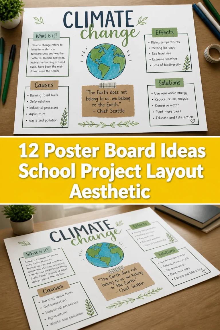
Divide your poster into distinct sections for each main point. Use boxes, lines, or different background colors to separate them.
Think about your poster’s focal point. What do you want people to notice first?
Plan where images, graphs, or diagrams will go. Visuals should support your text, not overpower it.
Pro Tip: Use the “rule of thirds” for a balanced design. Imagine your poster divided into a 3×3 grid and place key elements along the lines or at their intersections.
Step 4: Gather Your Materials
Now it’s time to collect everything you’ll need. A well-stocked workspace prevents interruptions later on.
You’ll definitely need a large poster board. Choose a color that complements your project’s theme but doesn’t distract.
Gather a variety of markers or pens. Different colors and tip sizes will help create visual interest and highlight information.
Make sure you have a reliable glue stick or spray adhesive. Elmer’s glue can cause paper to wrinkle.
Scissors or a craft knife (with adult supervision) are essential for cutting out text and images. A ruler is critical for straight lines and even spacing.
Don’t forget a pencil and eraser for initial sketches and guidelines. These will be erased later.
Step 5: Create Your Visual Elements
Start preparing all the individual pieces that will go on your poster. This includes your text, titles, images, and graphics.
Write out all your headings and body text on separate pieces of paper. Use your best handwriting or print them from a computer.
Cut out your text neatly. Leave a small border around each piece for a cleaner look.
Print or draw any images, charts, or diagrams. Ensure they are clear, relevant, and properly sized for your poster.
Consider adding decorative elements like borders or small illustrations. These can enhance the theme without being overwhelming.
Make sure all your visual components are ready to be placed before you start gluing. This allows for easy adjustments.
Step 6: Assemble Your Poster
This is the exciting part where your poster comes to life. Begin by lightly sketching your layout onto the actual poster board with a pencil.
Draw faint guidelines for where each section will go. This ensures everything is straight and evenly spaced.
Start with your main title at the top. Position it centrally and ensure it’s large enough to be seen from a distance.
Next, place your major headings. Arrange them according to your planned layout.
Once the headings are in place, position your body text and images within their respective sections. Don’t glue anything down yet.
Experiment with the arrangement. Step back and look at your poster from a distance to check the balance and flow.
Pro Tip: Take a photo of your planned layout before gluing. If something gets moved, you have a reference to put it back.
Step 7: Add Finishing Touches and Review
Once you are happy with the arrangement, it’s time to secure everything. Carefully glue each piece into its final position.
Apply glue evenly to avoid bubbles or loose edges. Press down firmly on each element.
Erase any visible pencil guidelines. A clean poster looks professional.
Check for any smudges or stray marks. Gently clean them if possible.
Add your name, class, and date in a discreet but visible spot, usually a bottom corner. This ensures proper credit.
Review your poster one last time for spelling, grammar, and clarity. Read it aloud to catch awkward phrasing.
Step 8: Practice Your Presentation
A great poster often comes with a presentation. Practice what you’ll say about each section.
Don’t just read directly from the poster. Your presentation should expand on the information.
Know your material inside and out. Be ready to answer questions about your project.
Time yourself to ensure you meet any time limits. Practice in front of a mirror or a family member.
Confidence in your presentation will elevate the entire project. Your poster is a visual aid; your voice tells the story.
Common Mistakes to Avoid
Too Much Text
A common pitfall is trying to cram too much information onto the poster board. Posters are meant to be quickly digestible.
Overloading your poster with text makes it overwhelming and difficult to read. People will lose interest quickly.
Focus on key points and use bullet points or short paragraphs. Let your visuals do a lot of the talking.
Cluttered Layout
A messy or disorganized layout confuses the viewer. If there’s no clear path for the eye, your message gets lost.
Avoid placing elements randomly. Every piece of text and every image should have a deliberate place.
Use white space effectively. Blank areas help separate sections and make your poster feel less crowded.
Poor Readability
Your beautiful research means nothing if it can’t be read. Small fonts, fancy scripts, or low-contrast colors are readability killers.
Choose clear, simple fonts for your text. Ensure your headings are much larger than your body text.
Use high-contrast color combinations, like dark text on a light background. Avoid light text on a light background.
Last-Minute Rush
Starting your poster the night before it’s due is a recipe for stress and mistakes. Rushing leads to sloppy work.
Allocate enough time for each step, especially research and design. Break the project into smaller tasks.
Allow time for glue to dry, ink to set, and for you to step away and come back with fresh eyes. This helps catch errors.
Troubleshooting
Running Out of Space
This happens when you have more content than your board can comfortably hold. It usually points to an issue with planning.
Go back to your outline and ruthlessly cut non-essential information. Can any text be condensed?
Can some information be conveyed more efficiently with an image or a graph instead of text? Prioritize only the most critical points.
Uneven Text/Graphics
Wobbly lines, crooked titles, or misaligned pictures make a poster look unprofessional. This is often due to not using guidelines.
Always use a pencil and a ruler to draw faint lines before placing anything. This provides a straight edge to follow.
Step back frequently to check alignment. Don’t glue anything permanently until you’re sure it’s straight.
Materials Not Sticking
Sometimes glue doesn’t hold, or edges start peeling. This can be frustrating right before a deadline.
Ensure you’re using the right adhesive for your materials. Glue sticks are great for paper; spray adhesive works for larger items.
Apply glue evenly to the entire back of the item, not just the corners. Press firmly for several seconds.
If something peels, reapply glue and place a heavy book on it overnight to ensure it bonds securely.
Key Takeaways
- Plan thoroughly: Always start by understanding your assignment and outlining your content.
- Prioritize clarity: Keep text concise, use clear headings, and maintain a logical flow.
- Design for readability: Choose appropriate fonts, sizes, and high-contrast colors.
- Utilize visuals: Images, charts, and diagrams enhance understanding and engagement.
- Use tools: Rulers, pencils, and quality adhesives are your best friends for a polished look.
- Proofread carefully: Always check for spelling, grammar, and alignment before submitting.
Frequently Asked Questions
What’s the best poster size for a school project?
Standard poster board sizes (like 22×28 inches or 24×36 inches) are usually ideal. They offer enough space for content without being too cumbersome.
Always check if your teacher has specified a particular size. Using the correct dimensions ensures your project meets all requirements.
Can I use a computer to design my poster?
Absolutely! Using a computer for text and graphics can give your poster a very professional look. You can print out all your elements and then mount them.
Just remember to still plan your layout carefully before printing. Ensure your printed elements are cut neatly and glued securely.
How do I make my poster stand out?
To make your poster memorable, focus on originality and visual appeal. Use a compelling title and an interesting color scheme.
Incorporate unique, relevant images or create your own hand-drawn illustrations. A clear, well-organized layout always makes a strong impression.
Our Top Recommended Finds
- Large White Poster Board: A sturdy, clean foundation for any project, offering maximum design flexibility.
- Assorted Permanent Markers (Fine & Broad Tip): Essential for clear headings, vibrant colors, and adding detailed labels.
- Acid-Free Glue Sticks: Ensures your elements stay securely attached without wrinkling paper or damaging photos over time.
Ready to Create Your Masterpiece?
Making a great poster for your school project doesn’t have to be a source of dread. With these steps, you have a clear roadmap to success.
Embrace the process of planning, designing, and assembling your ideas. Each stage is an opportunity to learn and express yourself.
Start today by reviewing your assignment and sketching out your initial thoughts. You’ll be amazed at what you can create.