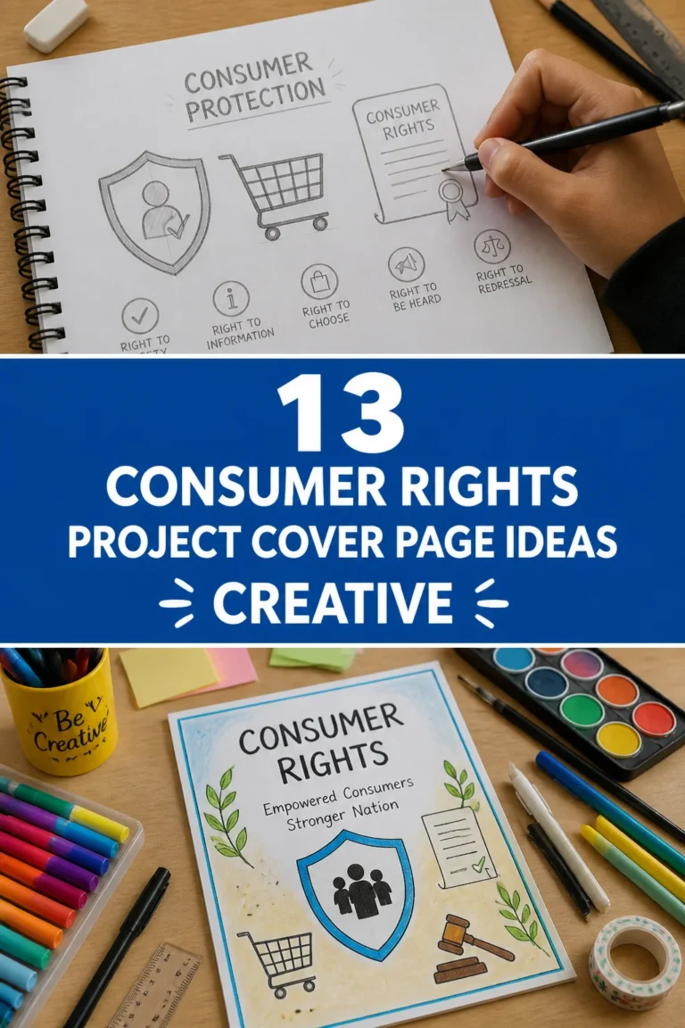
📁 How To Make Front Page Of Project File
Creating an impressive project file front page is more than just a formality.
I’ve seen countless projects, and the first impression truly sets the tone for the entire submission.
A well-designed front page immediately communicates professionalism and attention to detail, signaling the quality of work within.
Quick Overview
This guide will walk you through crafting a front page that grabs attention and clearly presents your project’s essential information. You’ll learn how to combine aesthetics with clarity, ensuring your work stands out.
- Time needed: 45-90 minutes (depending on design complexity)
- Difficulty: Beginner
- What you’ll need: Computer with word processing software (e.g., Microsoft Word, Google Docs), internet access for resources, a printer (optional, for physical submission), basic design sense.
Step-by-Step Instructions
Step 1: Understand Your Requirements
Begin by reviewing any guidelines provided by your instructor or institution. Different projects or courses might have specific mandates for what to include on the front page.
Check for mandatory elements like your name, ID, course code, project title, or submission date. Ignoring these can lead to lost marks.
Note any formatting rules, such as font types, sizes, or color schemes. These small details ensure compliance.
Pro Tip: Create a small checklist of all required information before you start designing. This prevents last-minute additions and ensures nothing is missed.
Step 2: Choose Your Tools and Format
Decide whether you will create your front page digitally or manually. Digital tools like Microsoft Word, Google Docs, or Canva offer flexibility and professional results.
Consider using a standard document format for digital submissions, typically PDF, which preserves your design perfectly. For physical submissions, a printed page is ideal.
Explore templates available in your chosen software. These can provide a great starting point and save significant design time.
Step 3: Structure the Core Information
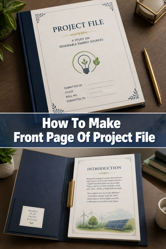
Place the most crucial information prominently. The project title usually takes center stage, often in a larger font.
Include your full name and student identification number directly below the title. This ensures easy identification.
Add the course name, code, and the name of your instructor or supervisor. These details provide context for your submission.
Specify the institution’s name and the submission date at the bottom. This frames your project within its academic environment.
Step 4: Select a Visual Theme and Layout
Choose a theme that aligns with your project’s subject matter. For a science project, a clean, technical look might be appropriate.
Think about the overall layout. A balanced design, with elements evenly distributed, is usually more appealing and easier to read.
Use white space effectively. Don’t cram too much information onto the page; ample blank space makes the page feel less cluttered and more professional.
Pro Tip: Sketch a few layout ideas on paper first. This helps visualize the arrangement of text and graphics before you commit to a digital design.
Step 5: Incorporate Design Elements
Add a relevant image or graphic if appropriate. This could be your institution’s logo, a thematic icon, or a subtle background design.
Ensure any images are high-resolution to avoid pixelation. Low-quality graphics detract from the professional appearance.
Consider adding a simple border or frame. A subtle border can define the page’s edges and add a touch of elegance without being distracting.
Harmonize colors. If you use colors, choose a palette that is professional and complements your institution’s branding or your project’s theme. Avoid overly bright or clashing colors.
Step 6: Choose Appropriate Fonts
Select professional and readable fonts. Sans-serif fonts like Arial, Calibri, or Helvetica are often good choices for titles and main text.
Limit your font choices to two or three at most. Too many different fonts can make the page look messy and unprofessional.
Vary font sizes to create a visual hierarchy. The project title should be the largest, followed by your name, and then other details.
Ensure sufficient contrast between the text color and the background. Black text on a white background is always a safe and readable option.
Step 7: Align and Format Text
Center the main title for a classic, balanced look. Other elements can be left-aligned, right-aligned, or centered depending on your design.
Adjust line spacing to improve readability. Avoid text that is too tightly packed or too widely spaced.
Use bolding sparingly for emphasis, typically on the project title or your name. Overuse of bolding can diminish its impact.
Maintain consistent spacing between different sections of information. This creates a clean and organized appearance.
Step 8: Review and Refine
Proofread every word on your front page carefully. Typos or grammatical errors on the first page create a poor impression.
Check all names, dates, and numbers for accuracy. A wrong student ID or submission date can cause issues.
Print a draft if submitting physically, to check how it looks on paper. Colors and alignments can sometimes shift during printing.
Ask a friend or classmate to review it for clarity and aesthetics. A fresh pair of eyes can spot mistakes you might have overlooked.
Common Mistakes to Avoid
Overcrowding the Page
Many people try to fit too much information or too many graphics onto the front page. This makes the page look cluttered and overwhelming, making it difficult for the reader to find key details. Always prioritize essential information and embrace white space to create a clean, professional look.
Inconsistent Formatting
Using different font styles, sizes, or alignments for similar elements across the page creates a disorganized appearance. Stick to a consistent design scheme for all text and graphical elements. Consistency signals professionalism and makes your front page feel cohesive.
Poor Readability
Choosing unreadable font colors (e.g., light gray text on a white background), overly decorative fonts, or tiny font sizes makes your front page inaccessible. The primary goal is clear communication. Always opt for legible fonts and ensure strong contrast between text and background colors.
Ignoring Institutional Guidelines
Failing to adhere to specific requirements set by your instructor or institution is a common oversight. This can lead to lost marks or even rejection of your project. Always double-check the guidelines and ensure every mandatory element is included and formatted correctly.
Troubleshooting
My Front Page Looks Too Plain
If your front page feels uninspired, consider adding a subtle design element. This could be a faint background watermark related to your topic, a simple geometric border, or a small, professional icon. Remember, subtle enhancements are often more effective than bold, distracting ones.
The Text and Images Don’t Align Properly
Alignment issues usually stem from using manual spacing or not utilizing the alignment tools in your software. Use the built-in alignment features (e.g., center align, left align, distribute vertically) in your word processor. For images, ensure text wrapping options are set correctly to allow for precise placement.
My Graphics Look Pixelated When Printed
Pixelation occurs when an image has a low resolution for the print size. Always use high-resolution images (at least 300 DPI for printing) for any graphics you include. If you sourced an image online, try to find a larger version or consider creating a vector graphic instead, which scales without losing quality.
Key Takeaways
- Always prioritize clear communication and adherence to any specific project requirements.
- Utilize white space effectively to prevent overcrowding and enhance visual appeal.
- Choose professional, readable fonts and limit their variety for a cohesive look.
- Incorporate subtle design elements like borders or relevant graphics thoughtfully.
- Meticulously proofread all text for errors and verify all factual information.
- Review your design on screen and, if possible, through a test print.
Frequently Asked Questions
Can I use a template for my project front page?
Yes, using a template is perfectly acceptable and often encouraged. Templates can save time and ensure a professional layout. Just make sure to customize it with your specific information and ensure it meets any institutional guidelines.
What’s the ideal font size for the project title?
The ideal font size for a project title typically ranges from 24 to 36 points. It should be noticeably larger than other text on the page, but not so large that it dominates excessively or looks unprofessional. The exact size can depend on the overall layout and the number of words in your title.
Should I include my email address or contact information?
Unless specifically requested by your instructor, it’s generally not necessary to include your email address or contact information on the front page. Your name and student ID are usually sufficient for identification. If it’s a group project, listing all group members’ names is standard.
How can I make my front page unique without being unprofessional?
Focus on subtle distinctions. You can achieve uniqueness through a well-chosen color palette that aligns with your project, a distinct yet professional font pairing, or a custom, relevant graphic that isn’t overly flashy. The key is to maintain a balance between creativity and academic professionalism.
Our Top Recommended Finds
- High-Quality Printer Paper: Using heavier, brighter paper (e.g., 24lb or 28lb) makes a noticeable difference for printed submissions. It feels more substantial and professional.
- Stylus Pen for Digital Drawing: If you’re incorporating custom hand-drawn elements digitally, a stylus pen can offer precision and a natural drawing experience on a tablet or touchscreen laptop.
- Premium Font Subscriptions: For those who frequently create professional documents, a subscription to a font library can provide access to a wider range of high-quality, unique fonts that elevate your design.
Craft Your Project’s First Impression
Your project’s front page is its handshake. It’s the initial connection you make with your audience, reflecting the care and effort invested in your work.
A thoughtfully designed front page doesn’t just present information; it sets a standard. It shows that you value your work and respect the person reviewing it.
Take these steps, apply your creativity, and make that first impression count. Start designing your standout front page today.