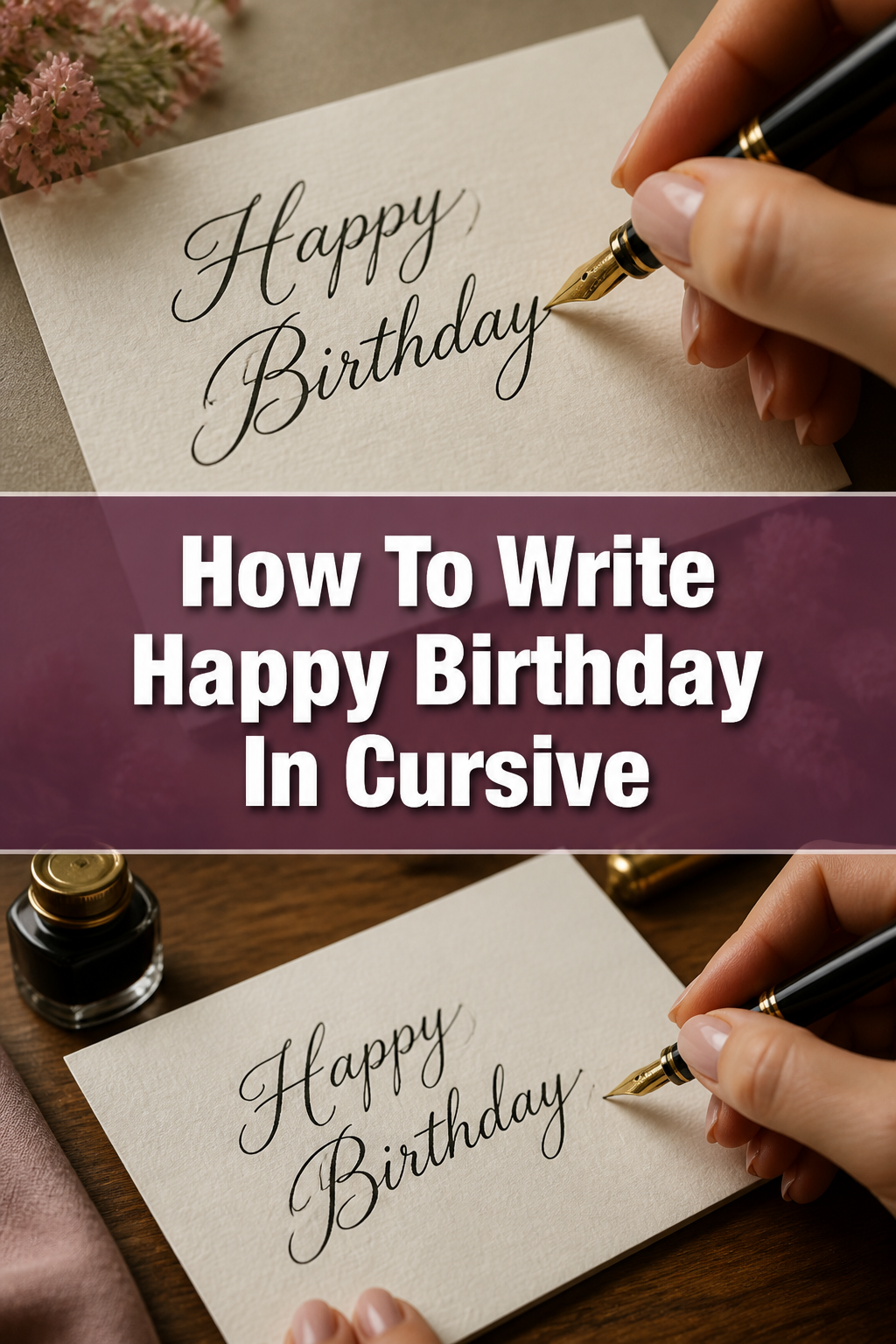
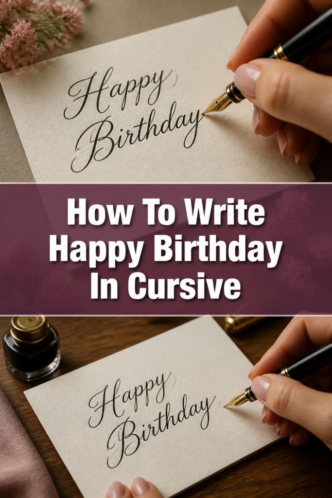
✍️ How To Write Happy Birthday In Cursive
I have spent years teaching hand-lettering and calligraphy to students who want to add a personal touch to their gifts.
There is something uniquely special about a handwritten card that an email or a printed font simply cannot replicate.
In this guide, I will show you exactly how to master the flowing loops and elegant connections of “Happy Birthday” in cursive.
Quick Overview
This tutorial covers the foundational strokes, letter connections, and stylistic choices needed to write a beautiful birthday greeting.
- Time needed: 20 to 30 minutes of focused practice
- Difficulty: Beginner
- What you’ll need: Lined paper, a smooth-flowing pen (gel or fountain), and a steady surface
Step-by-Step Instructions
Step 1: Prepare Your Workspace and Grip
Position your paper at a slight angle to allow for a natural slant in your writing. If you are right-handed, tilt the top of the paper to the left; if left-handed, tilt it to the right.

Hold your pen with a relaxed tripod grip, using your thumb and index finger to pinch the pen while it rests on your middle finger. Avoid squeezing the pen too tightly, as this leads to hand fatigue and shaky lines.
Sit up straight with both feet on the floor to ensure your arm has a full range of motion. Your elbow should rest comfortably on the table surface to provide a stable pivot point for your hand.
Pro Tip: Warm up your hand by drawing large, continuous “O” shapes or “S” curves across a scrap piece of paper for two minutes.
Step 2: Master the Capital H
Start at the top line of your paper and draw a vertical stroke downward to the baseline. Give this stroke a small hook at the top and a slight curve to the left at the bottom.
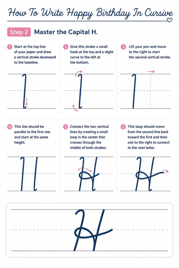
Lift your pen and move to the right to start the second vertical stroke. This line should be parallel to the first one and start at the same height.
Connect the two vertical lines by creating a small loop in the center that crosses through the middle of both strokes. This loop should move from the second line back toward the first and then exit to the right to connect to the next letter.
Step 3: Form the Lowercase A and P
Begin the lowercase “a” by pulling the exit stroke from the “H” into a rounded oval shape. Make sure the oval touches the baseline and the midline of your writing space.
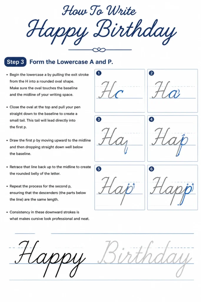
Close the oval at the top and pull your pen straight down to the baseline to create a small tail. This tail will lead directly into the first “p.”
Draw the first “p” by moving upward to the midline and then dropping straight down well below the baseline. Retrace that line back up to the midline to create the rounded “belly” of the letter.
Repeat the process for the second “p,” ensuring that the descenders (the parts below the line) are the same length. Consistency in these downward strokes is what makes cursive look professional and neat.
Step 4: Finish the Word Happy
Transition from the second “p” into the lowercase “y” by creating a “u” shape that sits on the baseline. Ensure the width of this “u” matches the width of your “a” for visual balance.

Extend the right side of the “y” down below the baseline to create a long, elegant loop. This loop should curve back up and cross the vertical line exactly at the baseline.
End the word with a flourish or a simple exit stroke that points toward the next word. Since “Happy” and “Birthday” are usually on separate lines, you can make this final tail a bit longer.
Pro Tip: When writing the double “p,” try to keep the loops at the top of the letters closed to maintain a clean appearance.
Step 5: Perfect the Capital B
Start at the top line and draw a straight vertical line down to the baseline. You can add a small decorative loop at the very top of this stem if you want a more formal look.
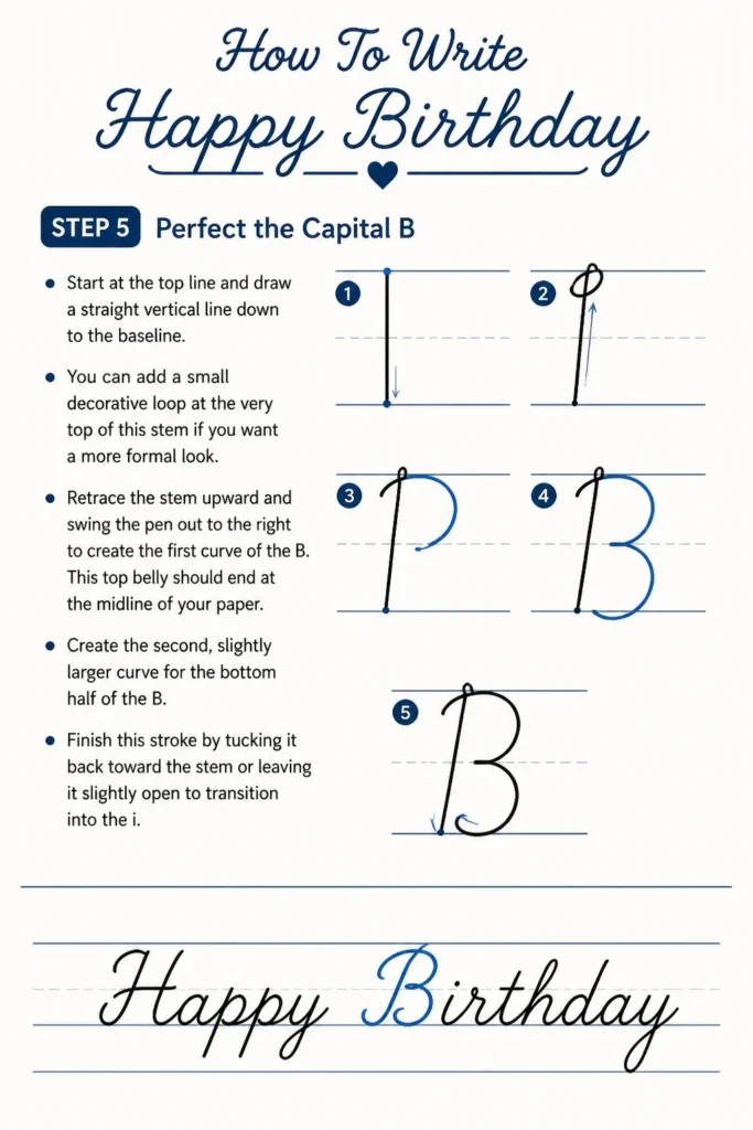
Retrace the stem upward and swing the pen out to the right to create the first curve of the “B.” This top belly should end at the midline of your paper.
Create the second, slightly larger curve for the bottom half of the “B.” Finish this stroke by tucking it back toward the stem or leaving it slightly open to transition into the “i.”
Step 6: Connect the Middle Letters of Birthday
Lead into the lowercase “i” with a short upward stroke and then pull it straight back down to the baseline. Do not dot the “i” yet; wait until the entire word is finished to maintain your flow.
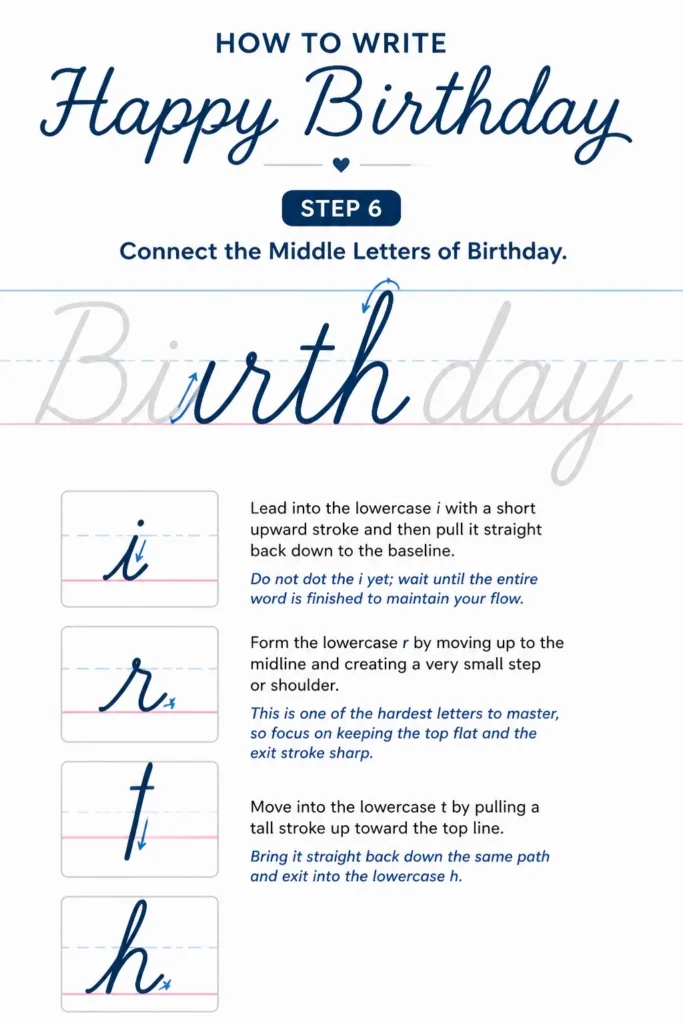
Form the lowercase “r” by moving up to the midline and creating a very small “step” or shoulder. This is one of the hardest letters to master, so focus on keeping the top flat and the exit stroke sharp.
Move into the lowercase “t” by pulling a tall stroke up toward the top line. Bring it straight back down the same path and exit into the lowercase “h.”
Step 7: Complete the Word Birthday
Draw the “h” by creating a tall loop that reaches the top line and then forms a hump on the baseline. Transition immediately into the “d” by making an oval similar to the “a” you wrote earlier.
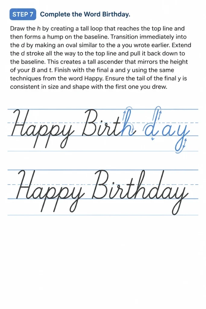
Extend the “d” stroke all the way to the top line and pull it back down to the baseline. This creates a tall ascender that mirrors the height of your “B” and “t.”
Finish with the final “a” and “y” using the same techniques from the word “Happy.” Ensure the tail of the final “y” is consistent in size and shape with the first one you drew.
Step 8: Add the Final Details
Go back and dot your “i” with a clean, single press of the pen. Avoid making large circles or “hearts” unless you are going for a specifically whimsical style.
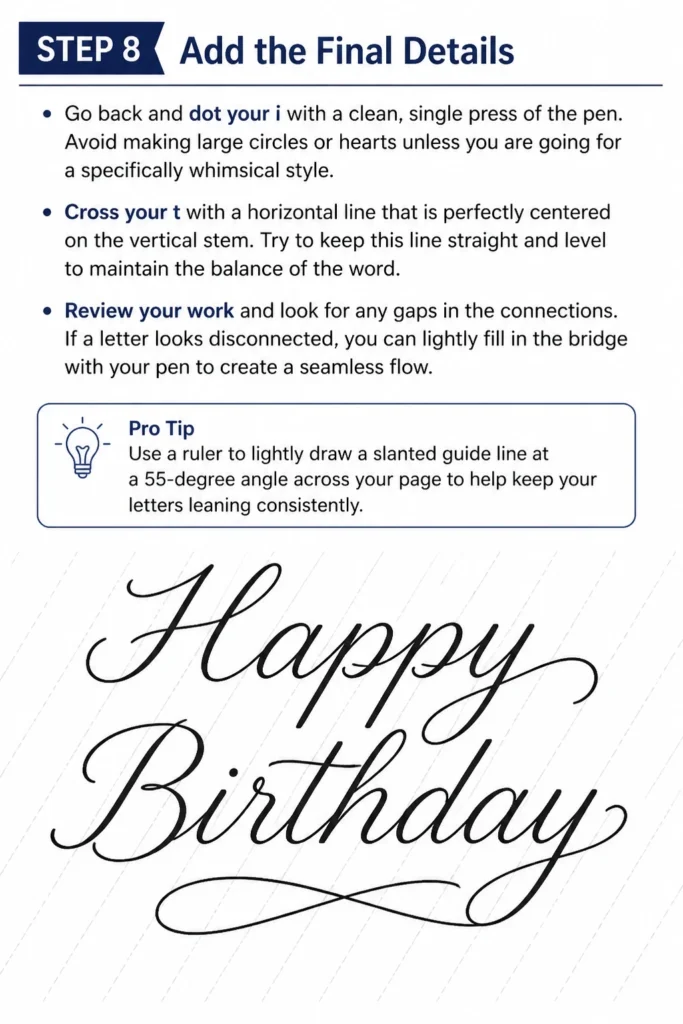
Cross your “t” with a horizontal line that is perfectly centered on the vertical stem. Try to keep this line straight and level to maintain the balance of the word.
Review your work and look for any gaps in the connections. If a letter looks disconnected, you can lightly fill in the bridge with your pen to create a seamless flow.
Pro Tip: Use a ruler to lightly draw a slanted guide line at a 55-degree angle across your page to help keep your letters leaning consistently.
Common Mistakes to Avoid
The Death Grip
Many beginners hold their pen so tightly that their knuckles turn white. This restricts the natural movement of your wrist and makes the cursive look stiff and jagged. Focus on keeping your hand soft and letting the pen glide across the paper.
If you find your hand cramping after just one word, stop and shake out your fingers. A light touch allows for the smooth, rounded loops that define high-quality cursive writing.
Inconsistent Slant
Cursive looks best when every letter leans at the exact same angle. A common mistake is having the “H” stand up straight while the “y” leans heavily to the right. This creates a visual “stutter” that makes the greeting harder to read.
To fix this, visualize parallel lines running through the center of every letter. Practice maintaining that specific angle from the first stroke of “Happy” to the last loop of “Birthday.”
Lifting the Pen Mid-Word
Cursive is designed to be written in a single, continuous motion for each word. Some people treat it like print and lift the pen after every letter, which ruins the flow and creates awkward ink blobs at the connection points.
Try to complete the entire lowercase section of a word without lifting your pen from the paper. Only lift your pen when you have finished the word and need to go back to cross “t”s or dot “i”s.
Troubleshooting
Ink Smudging and Messy Loops
Smudging is a common frustration, especially for left-handed writers or those using slow-drying ink. If you notice your hand dragging through the wet ink, try placing a clean piece of paper under your palm as a shield.
You can also switch to a quick-drying gel pen or a fine-liner. These pens deposit less ink and set almost instantly, keeping your “Happy Birthday” crisp and clean.
Shaky or Wobbly Lines
Shaky lines usually happen when you move the pen too slowly. Your brain tries to micromanage every millimeter of the stroke, which results in a nervous-looking line.
Increase your writing speed slightly to take advantage of the natural momentum of your hand. A faster, more confident stroke will result in smoother curves and straighter lines.
Key Takeaways
- Always maintain a consistent slant to ensure your writing looks professional and cohesive.
- Keep your grip relaxed to allow for smooth, flowing loops and to prevent hand fatigue.
- Complete the entire word before going back to cross your “t”s and dot your “i”s.
- Ensure the descenders on your “p” and “y” letters are the same length for visual symmetry.
- Practice the connection between the “r” and “t” in “Birthday,” as this is often the most difficult transition.
- Use lined paper during your practice sessions to help regulate the height of your letters.
Frequently Asked Questions
Is it better to use a ballpoint or a gel pen for cursive?
Gel pens are generally superior for cursive because the ink flows more freely with less pressure. Ballpoint pens often require you to press down harder, which can lead to hand strain and “skipping” in your lines. A smooth gel pen or a fountain pen will give you that classic, elegant look with much less effort.
How can I make my cursive look more modern?
Modern cursive often involves “bouncing” the letters, which means you vary the height of the letters slightly above and below the baseline. Instead of keeping everything perfectly on the line, let the “a” sit a bit lower and the “p” sit a bit higher. This creates a playful, rhythmic feel that is very popular in contemporary stationery design.
What if I am left-handed?
Left-handed writers should focus on “under-writing” rather than “over-writing” (hooking the hand). Position your paper at a sharp angle so that your hand stays below the line of writing. This prevents you from smearing the ink as you move across the page and allows you to see what you are writing more clearly.
How do I choose the right size for my letters?
The size of your writing should depend on the space available on your card or envelope. A good rule of thumb is to make your capital letters twice as tall as your lowercase letters. If you are writing on a standard 5×7 card, aim for lowercase letters that are about a quarter-inch tall.
Our Top Recommended Finds
- High-Quality Rhodia Paper: This paper is incredibly smooth and prevents ink from bleeding through, making it perfect for practicing your loops.
- Pilot Metropolitan Fountain Pen: This is an excellent entry-level fountain pen that provides a consistent ink flow for elegant cursive writing.
- Sakura Gelly Roll Pens: These pens come in various colors and offer a very smooth writing experience that is ideal for birthday cards.
Master Your Greeting Today
Writing “Happy Birthday” in cursive is a skill that will serve you for a lifetime of celebrations. Once you feel comfortable with the standard form, you can start experimenting with different slants and flourishes.
Try practicing on different types of paper or using metallic inks to make your greeting pop. You might even want to learn how to add small botanical doodles around your text for an extra touch of flair.
The best way to improve is to write one card every week until the movements become second nature. Start practicing your first “H” today and see how much your handwriting transforms.